DVH Analysis#
This notebook demonstrates how to compute and plot a DVH (Dose Volume Histogram).
Import Modules#
[1]:
try:
    import platipy
except:
    !pip install platipy
    import platipy

import matplotlib
import matplotlib.pyplot as plt
import SimpleITK as sitk

%matplotlib inline

from platipy.imaging.tests.data import get_hn_nifti
from platipy.imaging import ImageVisualiser
from platipy.imaging.label.utils import get_com
from platipy.imaging.dose.dvh import calculate_dvh_for_labels, calculate_d_x, calculate_v_x
from platipy.imaging.visualisation.dose import visualise_dose
Download Test Data#
This will download some data from the TCIA TCGA-HNSC dataset. The data is for one patient and contains a CT, dose and some structures.
[2]:
data_path = get_hn_nifti()
Load data#
Let’s read in the data that we’ve downloaded
[3]:
test_pat_path = data_path.joinpath("TCGA_CV_5977")

ct_image = sitk.ReadImage(str(test_pat_path.joinpath("IMAGES/TCGA_CV_5977_1_CT_ONC_NECK_NECK_4.nii.gz")))

dose = sitk.ReadImage(str(test_pat_path.joinpath("DOSES/TCGA_CV_5977_1_PLAN.nii.gz")))

dose = sitk.Resample(dose, ct_image)

structure_names =["BRAINSTEM", "MANDIBLE", "CTV_60_GY", "PTV60", "CORD", "L_PAROTID", "R_PAROTID"]

structures = {
    s: sitk.ReadImage(str(test_pat_path.joinpath("STRUCTURES", f"TCGA_CV_5977_1_RTSTRUCT_{s}.nii.gz"))) for s in structure_names
}
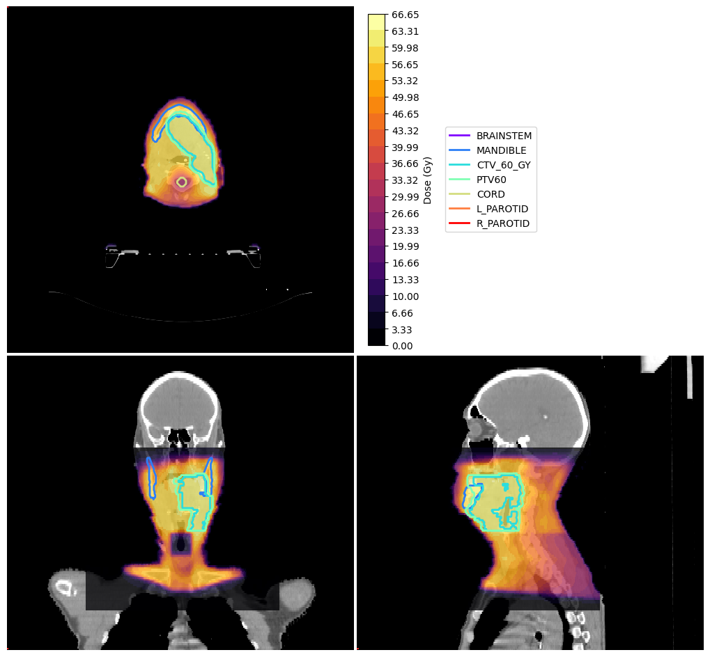
Visualise data#
and now let’s visualise the data we’ve got
[4]:
vis = ImageVisualiser(ct_image, cut=get_com(structures["PTV60"]))

vis.add_scalar_overlay(dose, discrete_levels=20, colormap=matplotlib.colormaps.get_cmap("inferno"), name="Dose (Gy)")
vis.add_contour(structures)

fig = vis.show()
Compute DVH#
here we compute the DVH using the dose and structures loaded. We get the DVH back in a pandas DataFrame object.
[5]:
dvh = calculate_dvh_for_labels(dose, structures)
[6]:
dvh
[6]:
| label | cc | mean | 0.0 | 0.1 | 0.2 | 0.3 | 0.4 | 0.5 | 0.6 | ... | 65.7 | 65.8 | 65.9 | 66.0 | 66.1 | 66.2 | 66.3 | 66.4 | 66.5 | 66.6 | |
|---|---|---|---|---|---|---|---|---|---|---|---|---|---|---|---|---|---|---|---|---|---|
| 0 | BRAINSTEM | 11.885166 | 9.360401 | 1.0 | 0.857974 | 0.857974 | 0.857974 | 0.857974 | 0.857974 | 0.857974 | ... | 0.000000 | 0.000000 | 0.000000 | 0.000000 | 0.000000 | 0.000000 | 0.000000 | 0.000000 | 0.000000 | 0.000000 |
| 1 | MANDIBLE | 62.763691 | 54.402473 | 1.0 | 1.000000 | 1.000000 | 1.000000 | 1.000000 | 1.000000 | 1.000000 | ... | 0.000418 | 0.000342 | 0.000266 | 0.000228 | 0.000152 | 0.000076 | 0.000076 | 0.000038 | 0.000038 | 0.000000 |
| 2 | CTV_60_GY | 190.980434 | 61.534935 | 1.0 | 1.000000 | 1.000000 | 1.000000 | 1.000000 | 1.000000 | 1.000000 | ... | 0.000300 | 0.000250 | 0.000162 | 0.000125 | 0.000112 | 0.000062 | 0.000037 | 0.000025 | 0.000012 | 0.000000 |
| 3 | PTV60 | 280.199051 | 61.134624 | 1.0 | 1.000000 | 1.000000 | 1.000000 | 1.000000 | 1.000000 | 1.000000 | ... | 0.000332 | 0.000281 | 0.000221 | 0.000179 | 0.000145 | 0.000085 | 0.000068 | 0.000051 | 0.000034 | 0.000017 |
| 4 | CORD | 24.590492 | 26.596514 | 1.0 | 1.000000 | 1.000000 | 1.000000 | 1.000000 | 1.000000 | 1.000000 | ... | 0.000000 | 0.000000 | 0.000000 | 0.000000 | 0.000000 | 0.000000 | 0.000000 | 0.000000 | 0.000000 | 0.000000 |
| 5 | L_PAROTID | 7.548332 | 22.993076 | 1.0 | 1.000000 | 1.000000 | 1.000000 | 1.000000 | 1.000000 | 1.000000 | ... | 0.000000 | 0.000000 | 0.000000 | 0.000000 | 0.000000 | 0.000000 | 0.000000 | 0.000000 | 0.000000 | 0.000000 |
| 6 | R_PAROTID | 12.702942 | 21.784250 | 1.0 | 1.000000 | 1.000000 | 1.000000 | 1.000000 | 1.000000 | 1.000000 | ... | 0.000000 | 0.000000 | 0.000000 | 0.000000 | 0.000000 | 0.000000 | 0.000000 | 0.000000 | 0.000000 | 0.000000 |
7 rows × 670 columns
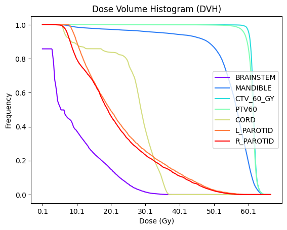
Plot DVH#
using the pandas DataFrame, we plot the DVH here. The DVH first needs to be reshaped to prepare it for plotting.
[7]:
# Reshape the DVH
plt_dvh = dvh
plt_dvh = plt_dvh.set_index("label")
plt_dvh = plt_dvh.iloc[:,3:].transpose()

# Plot the DVH
fig, ax = plt.subplots()
plt_dvh.plot(ax=ax, kind="line", colormap=matplotlib.colormaps.get_cmap("rainbow"), legend=False)

# Add labels and show plot
plt.legend(loc='best')
plt.xlabel("Dose (Gy)")
plt.ylabel("Frequency")
plt.title("Dose Volume Histogram (DVH)")
plt.show()
DVH Metrics#
Finally, we extract commonly used metrics from the DVH. In the following cells we extract the D0 and D95 as well as the V5 and V20.
[8]:
df_metrics_d = calculate_d_x(dvh, [0, 95])
df_metrics_d
[8]:
| label | D0 | D95 | |
|---|---|---|---|
| 0 | BRAINSTEM | 37.1 | 0.035205 |
| 1 | MANDIBLE | 66.6 | 36.565625 |
| 2 | CTV_60_GY | 66.6 | 60.255060 |
| 3 | PTV60 | 66.6 | 58.903234 |
| 4 | CORD | 37.7 | 6.558704 |
| 5 | L_PAROTID | 60.2 | 9.182000 |
| 6 | R_PAROTID | 58.7 | 7.333571 |
[9]:
df_metrics_v = calculate_v_x(dvh, [5, 20])
df_metrics_v
[9]:
| label | V5 | V20 | |
|---|---|---|---|
| 0 | BRAINSTEM | 6.253719 | 1.780987 |
| 1 | MANDIBLE | 62.763691 | 61.063766 |
| 2 | CTV_60_GY | 190.980434 | 190.980434 |
| 3 | PTV60 | 280.199051 | 280.199051 |
| 4 | CORD | 24.590492 | 20.592213 |
| 5 | L_PAROTID | 7.548332 | 3.736019 |
| 6 | R_PAROTID | 12.681484 | 5.893707 |
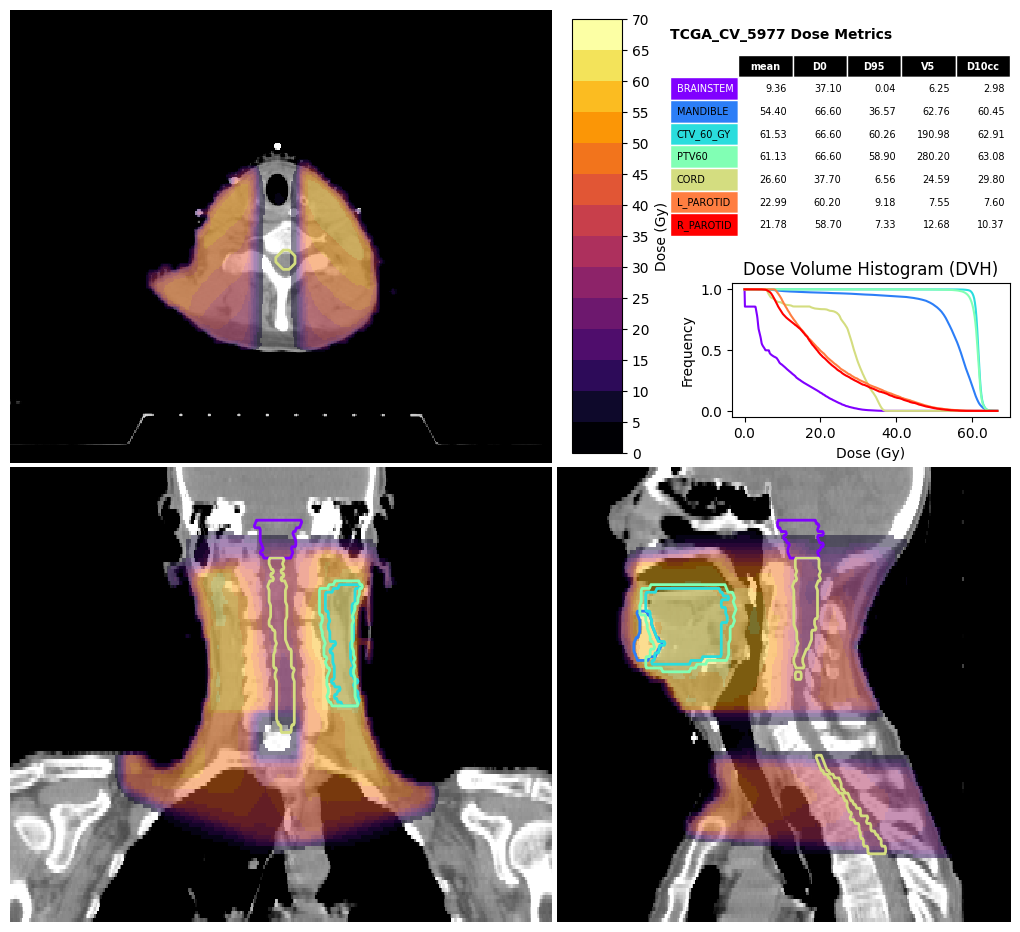
Dose and DVH visualisation#
The visualise_dose function can produce a visualisation including the DVH and dose metrics.
[10]:
fig, df_metrics = visualise_dose(
    ct_image,
    dose,
    structures,
    dvh=dvh,
    d_points=[0, 95],
    v_points=[5],
    d_cc_points=[10],
    structure_for_limits=dose>5,
    expansion_for_limits=40,
    contour_cmap=matplotlib.colormaps.get_cmap("rainbow"),
    dose_cmap=matplotlib.colormaps.get_cmap("inferno"),
    title="TCGA_CV_5977 Dose Metrics")
[ ]: